May 7
Cloud CMS lets you easily design and deploy forms for your web applications and content contributors. In this blog entry, we’ll walk through how you can do this within the Cloud CMS user interface.
In this example, we’ll create a form that allows editors to create City Guide information. Note: in the Cloud CMS Trial there is a City Guide Content definition which can be used as a starting point or as a reference for this example.
Add a Definition
The Content Definitions can be found in the Cloud CMS project: 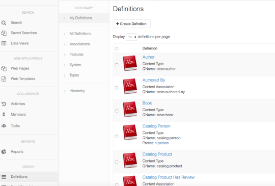
Next, we need to Create a new Definition. We begin by telling Cloud CMS what a City Guide is. This is a bit like defining a word in the dictionary. We will define a “City Guide” and tell Cloud CMS what schema it should have. The schema describes the properties, types, constraints and structure of the content.
When someone fills out the form, Cloud CMS can then capture the content and store it in a way that is searchable and reusable.
Click Create Definition. 
We provide a few properties for our new definition including a qname which defines a unique key (kind of like a dictionary “word”) which is ours.
Now we define the schema of this definition. Cloud CMS uses JSON Schema for content modeling.
{
    "title": "Guide City",
    "type": "object",
    "properties": {
        "title": {
            "type": "string",
            "title": "Title"
        },
        "summary": {
            "type": "string",
            "title": "Summary"
        },
        "body": {
            "type": "string",
            "title": "Body"
        },
        "state": {
            "type": "string",
            "title": "State"
        },
        "loc": {
            "type": "object",
            "title": "Location",
            "properties": {
                "latitude": {
                    "type": "number",
                    "title": "Latitude"
                },
                "longitude": {
                    "type": "number",
                    "title": "Longitude"
                }
            }
        },
        "highlights": {
            "type": "array",
            "items": {
                "type": "string"
            },
            "title": "Highlights"
        },
        "testimonials": {
            "type": "array",
            "items": {
                "type": "object",
                "properties": {
                    "text": {
                        "type": "string",
                        "title": "Text"
                    },
                    "author": {
                        "type": "string",
                        "title": "Author"
                    }
                }
            },
            "title": "Testimonials"
        }
    },
    "_parent": "n:node",
    "description": "guide:cityexample",
    "$schema": "http://json-schema.org/draft-04/schema#"
}
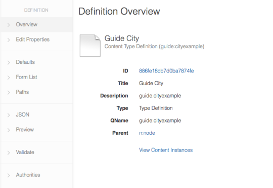
If happy with your edits you can now save our definition. Cloud CMS instantly compiles the definition with no server restarts and no downtime. The Contentent Definition Overview shows us that our definition is loaded up and ready to go.
Add a Form
So far, we’ve defined what a City Guide is. That is to say, we’ve defined the model for a City Guide. We now want to add a form that can be used to create new City Guide content instances.
Cloud CMS lets you have many forms for a single definition. You might choose have one form for administration that shows all fields and gets down and dirty. You might have another form that simplifies things, has a simple layout and is intended for users on a web site.
Click Form List which will list all the available Forms for the Type Definition - there are none since it is a new definition. Let’s create a simple form. All we have to do is click on Create Form.
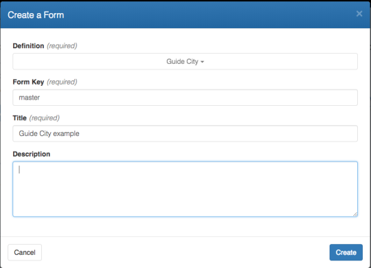
We now provide some configuration for our form. We can do many things here such as modify the layout, the placement of fields, plug in custom templates and configure different kinds of fields (or controls) for our field elements.
Let’s use the following configuration to customize the fields for our form:
{
    "title": "Guide City example",
    "fields": {
        "title": {
            "type": "text",
            "label": "Title"
        },
        "summary": {
            "type": "textarea",
            "label": "Summary"
        },
        "body": {
            "type": "ckeditor",
            "label": "Body",
            "ckeditor": {
                "toolbar": [
                    [
                        "Format",
                        "Font",
                        "FontSize"
                    ],
                    [
                        "Bold",
                        "Italic",
                        "Underline",
                        "StrikeThrough",
                        "-",
                        "Undo",
                        "Redo",
                        "-",
                        "Cut",
                        "Copy",
                        "Paste",
                        "Find",
                        "Replace",
                        "-",
                        "Outdent",
                        "Indent",
                        "-",
                        "Print"
                    ],
                    "/",
                    [
                        "NumberedList",
                        "BulletedList",
                        "-",
                        "JustifyLeft",
                        "JustifyCenter",
                        "JustifyRight",
                        "JustifyBlock"
                    ],
                    [
                        "Image",
                        "Table",
                        "-",
                        "Link",
                        "Flash",
                        "Smiley",
                        "TextColor",
                        "BGColor",
                        "Source"
                    ]
                ]
            }
        },
        "state": {
            "type": "state",
            "label": "State"
        },
        "loc": {
            "type": "object",
            "label": "Location",
            "fields": {
                "latitude": {
                    "type": "number",
                    "label": "Latitude"
                },
                "longitude": {
                    "type": "number",
                    "label": "Longitude"
                }
            }
        }
    },
    "engineId": "alpaca1",
    "_form_key": "master"
}
As you can see, each field has been given a label and a type. The type identifies which field control to use.
We now save our form. Cloud CMS automatically compiles the form and brings it online.
Create Content using our Form
Now we can create content using our form.
- In left nav, click Content - a list all the content types will be displayed.
- Select the content type you have just created
- click Create Content
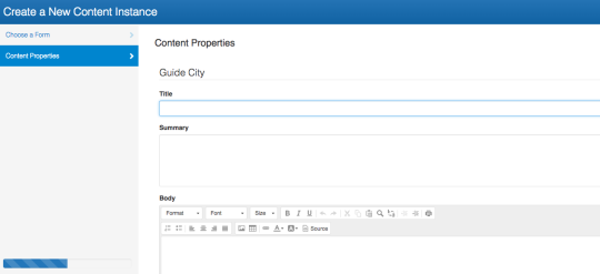
Notice that Cloud CMS automatically fires validation logic for things like required files. The Cloud CMS forms engine is very configurable and provides drop downs for selectors, date pickers, custom formatters and much more.
Any questions?
I hope this article encourages you to further explore the many features of Cloud CMS. If you have a question, or cannot find a feature you are looking for, or have a suggestion - please Contact Us.